Let’s say a user wants to book a flight without having a set destination, how would they do this? In this example, we’ll assume they don’t know you can do so through the Fare Finder tool, nor the Route Map.
In this messy task flow, I have only used the journey taken if the user looks at the “Plan” option from the navbar, as all the rest will not bring you to the right place.

As you can see, apart from one of those arrows, there isn’t a straight way to this option from the Home page.
Even the Route Map way available from Home is actually at the very bottom and can easily be overlooked. I only discovered it during a user testing when one of my guinea pigs stumbled onto it.
So how could we make it a “less clickable” way? I have a few options I would like to introduce:

This option is inspired by Skyscanner, if you click on “Can’t decide where? Click here to search Everywhere”, it’ll bring you to the Fare Finder tool. Even though you still need to click twice, it’ll show clearly that the option of booking a flight without a set destination exists, which many users aren’t aware of.
The other prototypes were built using Justinmind:


The top of the page is what you currently have on Ryanair: at first a simple search bar where you choose your destination, once that’s completed, it opens up and lets you select the dates you want. I have simply added the interactive map, which give you the option to pretty much pick anywhere. It all looks very blue.
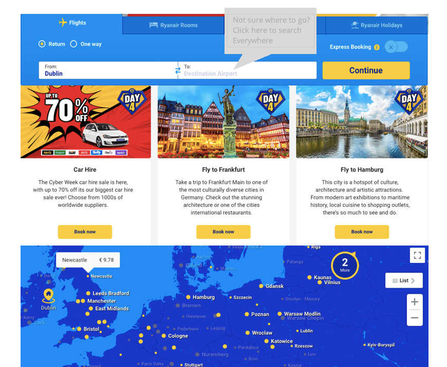
Then comes into action the “Not sure where to go? Click here to search everywhere”. I have also included ads in between the search bar and the map, as Ryanair heavily relies on those for revenue purposes. Once you click on that “pop up”, it brings you to the Fare Finder page:
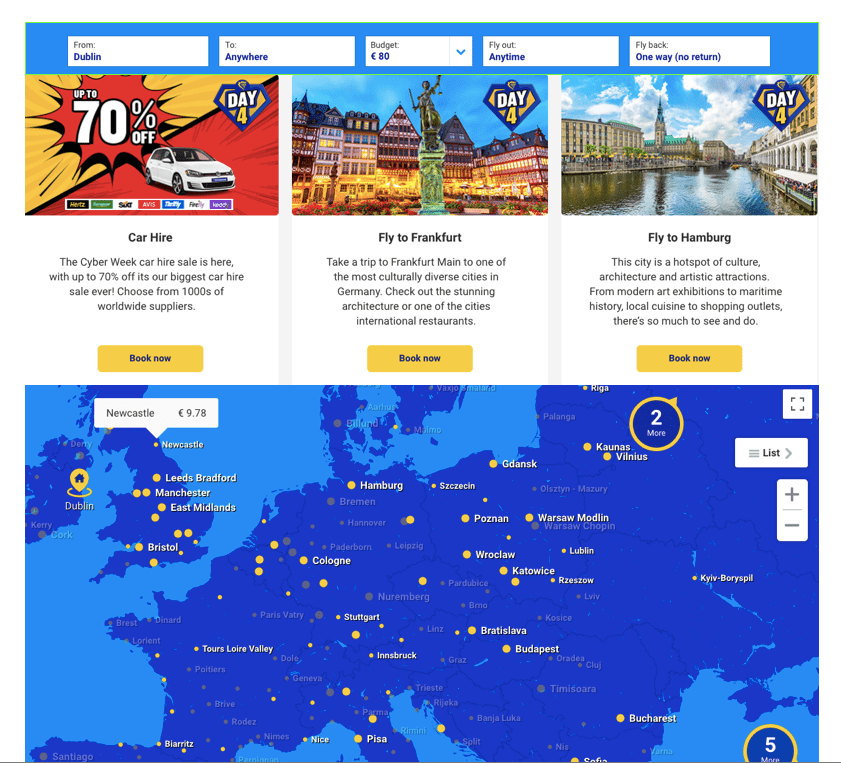
I thought this option looked quite messy, it feels like too many options and hurts the eyes. Had I gone for that option, I would have added some kind of “Let’s Go” call to action button.
Next, I decided to put the current Fare Finder page on the Homepage, instead of the current way of searching:
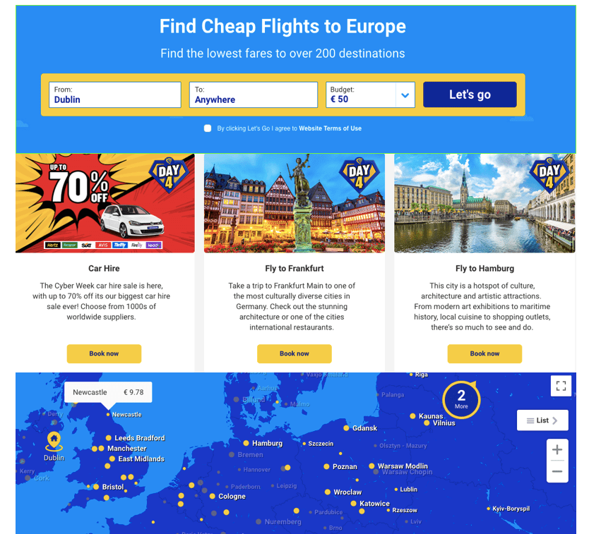
It looks better, but then again, not everyone books flights according to their budget.
My final solution resembles the current Homepage, but allows you to fly Anywhere, and to pick a budget if you’d like (there will be a “no budget” option too for people who don’t have a particular budget). It also includes the interactive map, and the ads:
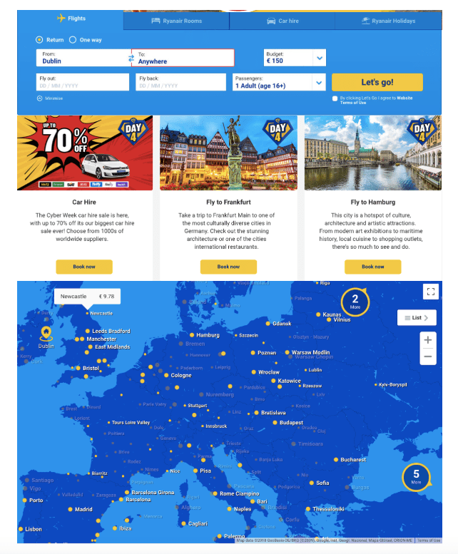
I think the options are quite clear, allowing you to choose a destination or not, fly according to a certain budget or not. The map being slightly separated from the search bar means it isn’t too distracting for those it might incommode, but still in sight to tempt others to play with it and possibly book more flights.
