I did three user testing sessions using Silverback, and unfortunately the quality of each recording is quite bad, for various reasons…
I asked the users the same type of questions: how often do they travel, which company/website do they normally use and why, what are their main criteria when booking (destination, budget, dates, etc).
Their task was then to book a weekend away (12th to 13th of January), within a certain budget.
Test 1
The first one was done in class with one of my classmate, Alessia, and the noise in the background is too loud to allow me to use it.
During this session, I asked her a few questions about her travel habits, and she then tried Ryanair’s website, followed by my mock-up.
Alessia doesn’t travel often, but uses Ryanair when she does, at it’s the cheapest. She didn’t know about the Fare Finder tool, so when I asked her to book a holiday for the weekend of the 12-13th of January, within an €80 budget, she picked Portugal, thinking it would be cheap. The total for those dates exceeded the budget, so she selected a city in the UK instead, and managed to find flights under €80.
As it was not exactly what I wanted her to do, I then asked her to find a list of countries where she could fly, within that budget.
She went into Plan, clicked on “Search Flights”, which brought her back to the Home Page. She went back to Plan, and wondered about “Search Ryanair Tickets” (but didn’t visit the page. In case you’re also wondering, as I was, it allows you to buy theatre tickets…).
She then went into “Destinations”, where you select the airport you’re leaving from, and then it shows you a list of where you can go. But there was a bug with that page when she first tried, as you can see on that screenshot: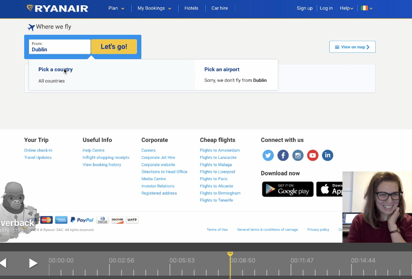
She thought it was quite funny (but also frustrating).
The other thing that is wrong with this page – when it works – is that it shows you the list of every cities you can fly to from Dublin, and when you hover on those names, they all turn blue and underlined, as if they were links. Most of them are indeed, but I’ve tried clicking on quite a few, and nothing happens… That was a frustration too, but not a problem we’re focusing on today (even though it appears to be quite simple to solve: don’t have them act like links if they aren’t!).
Once she clicked on a city, it brought her to a page describing what to do there, but as she said “it doesn’t give me a chance to book a flight”; she scrolled up and down several times, without seeing the “Book Now” button.
She was annoyed it wasn’t showing her prices and dates straight away. “That’s kind of pointless.”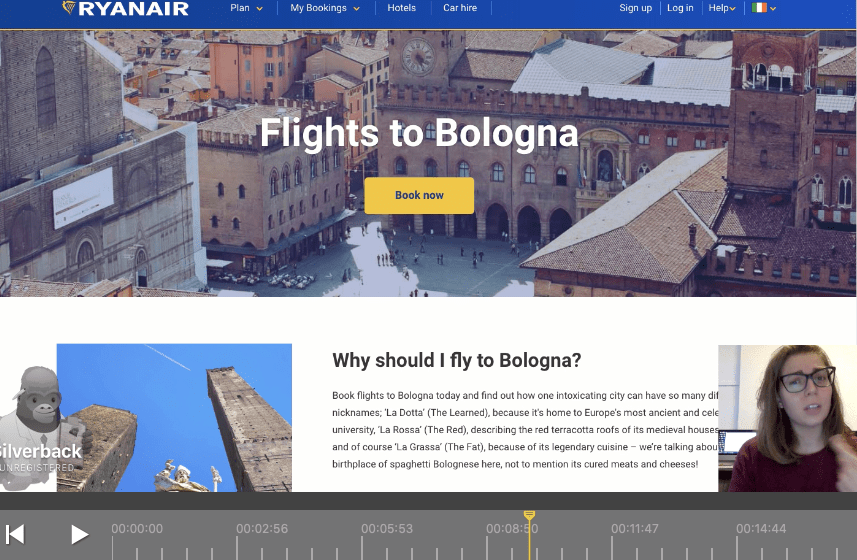
After she clicked on “Book Now”, it brought her to the Fare Finder page, but instead of saving her destination as Bologna, the option she was seeing was the following:
She was not impressed that she would have to select her destination again, even though she had clearly done so already earlier.
However, she was also relieved to have found the way of searching with the conditions I had given her. “I found it, that’s great, after I don’t know how long! It is annoying that you need so many clicks to do that, it is really really annoying”.
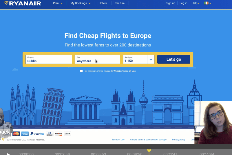
When seeing the chart showing all the different prices for a whole month, her reaction was “That’s handy! From where I was, I could never had said you could have come in here”.
As Alessia never books flights without researching and knowing first where she’s going, she wouldn’t really be a prime user of the Fare Finder tool. What she told me she would really find useful would be to be able to select only a couple of destinations so that she could compare the prices.
That’s a very interesting feature, one that could be added to the website in the future, perhaps using checkboxes.
When I showed her my mock up, she said “Yes, that’s what I was saying, if you have the option at the beginning, you avoid all those extra clicks that are really annoying, you have directly what you’re looking for.”
She wasn’t that impressed with the map feature (I showed her the interactive one on the website), as she thought it was a bit too slow: you click on your destination, then have to wait for the plane to fly there before it displays the price of the ticket. But she did think it was a good idea to be able to actually see where you can go, especially if geography isn’t your strongest point.
Test 2
The second session, with my housemate Sara, is the one I’m sharing, but for some reason Silverback did not record the screen, only her face, which is quite frustrating…
Sara normally flies with Ryanair, as it’s the cheapest. She said that when she flies with her best friend, they “go to the section where you can see where it’s the cheapest, dates and countries” and go somewhere they’ve never been.
As she obviously already knew about the Fare Finder tool, when I gave her the same task, she knew more or less where to go. Her reaction was “I normally do this through Google, I don’t really know how to find the page”. She usually types “Ryanair fares”, which indeed brings you to the Fare Finder page.
She first became aware of that tool totally by coincidence, by typing in Google “how to find the cheapest flights with Ryanair”.
She clicked on Plan, and pretty much found the Fare Finder option straight away.
I then put her in front of my mock-up and asked her to do the same. She was at first a bit confused as some part of the mock-up weren’t clickable.
Her main impression was that “it’s easier because on the other one [current Ryanair Homepage] I had to think where I found it [the Fare Finder tool] because usually I don’t do it from the website. Here it’s on the main page, I don’t have to go on another menu to find it, so I think it’s easier […] actually I think it’s much better because in the other one they don’t tell you on the main page, and I didn’t know for years I could do it”.
If you want to check out Sara’s test
Test 3
After realising the recording hadn’t worked properly, I tried to record Sara again, but this time I think there was a bug with Silverback as you can see the session and how long it lasted, but it refuses to open…
On that last recording, I got her playing with the mock-up a bit more, as we had already established that she knew about Fare Finder, so I showed her the interactive map on Ryanair’s website to get her thoughts.
It took her quite some time to understand how it worked, and she became quite frustrated with it. So I’ve decided to drop this feature, and keep simply the “Anywhere” feature, as well as the “Budget” option, and leave the rest as is.
It is better not to try to change too many things, and adding more things can sometimes make it worse. As my dad loves to say “le mieux est l’ennemi du bien”, which means “better is the enemy of good”.
KISS, basically.
So my (current) final mock-up looks like this:
Those sessions taught me a lot about frustrations encountered on Ryanair’s website, but also on my own mock-up.
I can also safely say that I do not recommend Silverback, as 2 recordings out of 3 were faulty!
Here are a few articles on users testing airline websites:

Silverback is a great tool! I think in Sara’s test you selected ‘Desktop’ instead of Browser Tab as the target for the video. Showing how messy your computer is…. 😦
LikeLike