Finally, this term is coming to an end. I have to say, even though it’s been a lot of work, I’ve really enjoyed it and have learnt a lot.
Designing an app is not an easy thing to do, and it involves way more than I would have originally thought. From the research, looking at what the competitors are doing, the user interviews, creating personas, user flows, wire flows, drawing wireframes, refining them into detailed wireframes, working out the branding of the company, figuring out the UI, doing user tests…
The whole process makes you think about everything in a lot of details. And now I find myself noticing more and more the interactions happening in the apps and websites I’m visiting, and everything else around me. I used to make fun of my designer friends about it and here I am…
In previous articles, I’ve discussed why I’ve decided to create Homi, and detailed user interviews.
After that, I’ve come up with a couple of user flows:
- Find a room you’re interested in, and start messaging the person who posted that ad.
- Pay your rent/Check your rent history


I have later on used those user flows as tasks in my user testings to make sure it was an easy process, and it was.
Then it was on to creating wireframes and wire flows.
As I hadn’t realised we were only creating a MVP (minimum viable product), I did a LOT of detailed wireframes, so I will not share them all here (I had about 35), I will just put my wire flow:
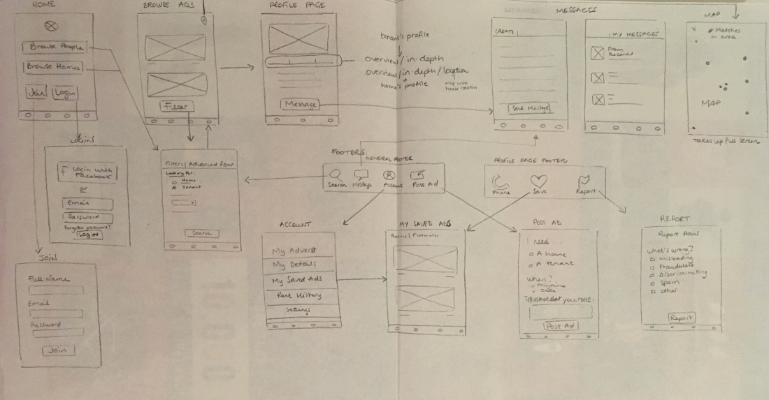 I have since then changed a few things, like the main buttons on the Homepage, you cannot “Browse People” anymore, and I’ve added a “Share” option to the footer of the profile pages. Those changes appear in the detailed wireframes.
With that being done, it was on to the UI. First, finding a name. I liked the sound of Homi, as it’s homey, but also homie. Yes, I’m very funny.
After that, I defined the branding: Homi is all about being friendly, cosy, warm, fun, easy, but also professional and trustworthy. Pretty much the opposite of what house hunting currently is.
I looked into what kind of colours my competitors were using, and what kind of colours are used by real estate websites and companies in general: blue was pretty much number one, as it inspires trustworthiness, seriousness and professionalism. It is apparently the most requested colour in the real estate industry.
I also chose orange for the fun, friendly and positive side of Homi. I had considered yellow, but it was a bit too Ryanair-like.
While designing the logo, I toyed with the idea of keys and a cup of tea (because nothing says home like a good cuppa), but ended up going with the more traditional house, as I thought I might as well use the fact that the H and I of Homi looked like the outside walls of a house.
After playing on Illustrator, here’s what I came up with:
At first, I had omitted the dot on the “i”, but as it made it hard to decipher that letter, I added it and used it like a chimney.
After this, it was on to choosing the typography. Most of my competitors were using Open Sans, which has a neutral and friendly appearance. It’s good for mobile apps as it’s easy on the eyes, so that’s what I decided to use also. For all my buttons, I used Raleway as it’s very round and friendly. I wanted to stay on the modern side, which is why I went for sans-serif. It is also more readable.
I then designed all my screens using Justinmind (as I had for my wireframes), and then exported them to InVision. Once I could open the app on my phone, I realised that the size of my font was way too small. I had read somewhere that the minimum size should be 11, and that’s what I had used everywhere… But the recommended size is actually 16 for the body, so after changing everything, I was able to start testing… Because asking myself “is it better like this or like that?” doesn’t help much, what I needed was the opinion of real users.
So my poor friends, who had already gone through the interviews (and let’s not even mention the fact that I had used them on the Ryanair project too), had to indulge me again. And here were their thoughts:
- When asked to search for a flatmate, they were pretty confused by the term “tenant”, which I have since changed to “flatmate”. Even though technically speaking, you’d be looking for a tenant to fill in the room, if 4 users out of 4 are confused by it… And as I’ve already established, the owner would not be the primary user of this app, but more so people looking for a flatmate.
- I asked Cassie and Derbhla if they had seen an icon at the top right corner of a page and both said no, so I changed it to make it more obvious (it was the pin that would bring you to a Map View. As it wasn’t coloured in and pretty light, it was discreet to me, invisible to others.) After I mentioned it, both said that it’s a feature they actually use when looking for a place, so it definitely needed to be noticed.
- While both Megan and Stephen said that they liked the interface, that it was simple and sleek, Cassie said it wasn’t appealing and didn’t feel natural (talking about the Profile page). Was she the only one being honest? Probably.
- All users really liked the idea of being able to pay rent through the app, therefore having a clear trace of all payments.
- Derbhla, who knew nothing about the app, said she was surprised to be able to look for a flatmate (being used to Daft) and that it was a really good idea.
After taking in all the feedback from those interviews and making changes accordingly, here are a few screens:


What I would have liked to add is a shadow on my buttons, but Justinmind is an absolute pain for that, as it doesn’t show it as you add it, you need to Simulate every time you want to find out what it looks like, and I didn’t have the time.
It’s also a shame that you cannot scroll nor swipe on InVision , as that confused most of my users. Even though they all naturally swiped on the tab of the Profile Page, InVision just brought them to the next screen, which was a bit unexpected for them.
Even though I kind of dropped the idea of adding a section for “What to do in case of a serious problem with my landlord/tenant?”, it is a feature to keep in mind, possibly for a desktop version as something to be added in the footer.
